Your Guide to Le Creuset Colours
Since introducing our signature Volcanic colour in 1925, we've been known for pioneering high-quality, colourful cookware. Our early artisans transformed the industry by bringing bold, true colour to the kitchen. That legacy continues, and we now offer an unmatched range of vibrant, durable colours and trend-leading hues. You could even say colour is in our DNA!
But with so many options to choose from, we know it can take a lot of work to narrow down the choices. If you're uncertain about picking a palette for your kitchen and decor, our comprehensive guide will help you explore the different options available so that you can incorporate our colours into your home in a style that reflects your personality.
Find your best colour match
Our design-forward approach has resulted in the release of some of the world’s most sought-after shades. Explore some of our most popular and newest hues to discover your own colour combinations.
Get to know our most popular colours stories
Our bold commitment to colour sets us apart—just as it did in 1925. Find out more about our colour range offerings below and what inspired them.
Cerise
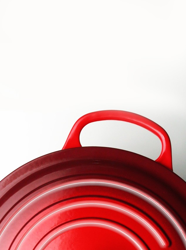
A direct translation of the French word for ‘cherry’, our Cerise cookware collection is sure to stand out on any dinner table. Believed to stimulate the appetite, this vibrant red embodies the passionate spirit that goes into preparing our best-loved recipes and adds depth to other fiery tones.
Volcanic, the original icon
The original Le Creuset signature colour since 1925. Inspired by the colour of molten cast iron, our world-famous volcanic orange is synonymous with the heritage and craftsmanship of Le Creuset cast iron cookware and still makes an iconic style statement today. Its glowing, confident orange is ready to fire up your kitchen and appetite.
Nectar
Nectar shines a rich, golden glow wherever it is placed. Blending a ray of sunshine, a swirl of honey, and a hint of caramel, it is designed to delight the senses. The perfect way to make a sunny statement in the kitchen, complement the yellow tones of Nectar with colours that are rich and soulful.
Bamboo
Like the tropical grass that inspired it, Bamboo is a verdant and versatile evergreen. Purposefully crafted to be a true green, this rich, organic shade uplifts and soothes, shining its perennial beauty inside the kitchen and on the table.
Sea Salt
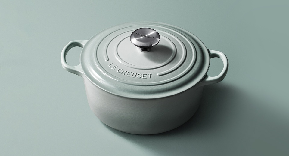
Inspired by the sea’s most treasured mineral, Sea Salt is an elemental pinch of flavour, ready to enrich any décor with its nuanced subtlety and style. Let it season a neutral palette or be a balm to bolder hues. This colour adds a thoughtful touch to any kitchen, remaining relevant for years to come.
Chambray
Inspired by its free-flowing textile namesake, Chambray is the softest slate blue with grey undertones. It is flexible enough to compliment rich and bright tones, or to add texture and flavour to a crisp, neutral palette.
Coastal Blue
This exquisite, soft pastel shade of blue evokes all that is magical about the coast, bringing the spirit of the seaside into the kitchen. Contemporary and timeless, it ties in beautifully with a beach-inspired colour palette.
Azure
Brilliantly bold, Azure is a cool and deep organic blue designed to enhance every décor with its cultured beauty and grace. Set it off with the crispness of white or blend it into a seascape of blues. This true blue features a rich gradient and ensures your favourite pots, pans, and accessories stand out.
Meringue
Much like the French delicacy it is named after, our Meringue collection is soft, pure, and has a place at every dinner table. A luxurious ivory tone by nature, Meringue inspires elegance with a soft and creamy colour palette. Layer it with soft tones or use it as a go-with-everything neutral.
Shell Pink
Subtle, yet daring, this powder pink is extremely easy to pair existing cookware with, providing a much-needed breath of fresh air. Use it as an enchanting accent, as a grace note to a neutral décor, a soft touch against reds and oranges, or just a pretty colour on its own.
Garnet
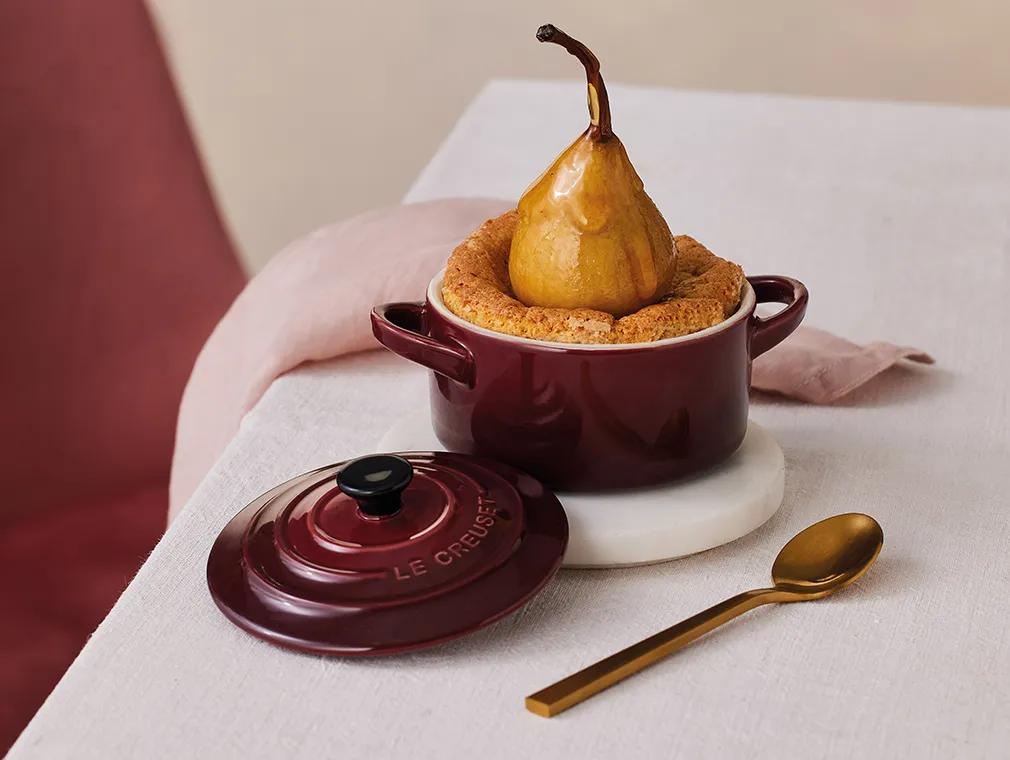
Garnet is a sumptuous red-plum so deep, so luxurious, so juicy, you can practically taste its richness. The ultimate culinary companion, it’s steeped in nuance and flavour.
Flint
Our Flint collection is a fundamental grey that is carefully crafted to pair with everything in your kitchen. Inspired by the clay of the earth and glistening stones polished by surf, this colour blends in easily with existing kitchen décor, offering a neutral and balanced colour palette.
Satin Black
There’s a reason black never goes out of style. Satin Black is our deepest matte version yet, sweetened with just a glimmer of sheen. It’s day-to-night sophisticated, goes with everything, and always looks amazing.
Now that you've seen all our colours, which ones will you be bringing into your kitchen scheme? Combining our timeless designs with the trendiest colours creates the perfect mix of functionality and aesthetics to help make your kitchen stand out. And if you're looking for more inspiration on how to mix and match bold colours or subtle shades, be sure to follow us on Instagram.
More to explore
With your favourite colours in mind, discover our top tips for choosing the right cookware material, along with helpful guides to casserole shapes and sizes.


